

What 2025’s Biggest Rebrands Teach Us About Identity, Legacy, and Evolving With Purpose
I’ve been paying close attention to the big brand moves happening this year, and let me tell you, 2025 has been one for the books.
Companies with decades of name recognition are rewriting who they are, how they show up, and what they want the world to see.
And honestly? These campaigns say a lot about identity. And not just for corporations, but for any of us trying to evolve without losing our roots.
Take Jaguar’s bold, beautiful, and slightly confusing rebrand.
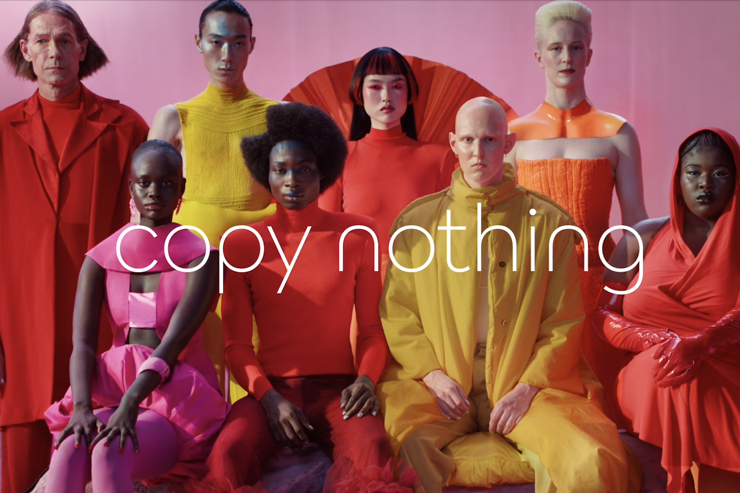
An image from a press release describing Jaguar’s new rebranding. The U.K. luxury carmaker’s rebrand campaign has caused online backlash. Jaguar
Jaguar stepped out this year with a rebrand that felt like a surprise party you weren’t quite ready for. Pink palette. Clean typography. A cinematic commercial with elegant bodies, electric energy… and not a single car.
The message? “Copy nothing. Delete ordinary. Live vivid.”
Now, I love a bold move. But the internet had feelings… big ones.
Some people cheered the bravery. Some said the brand lost its heritage. And honestly, both can be true. Reinvention is powerful… but it’s also delicate.
The lesson?
You can push forward, but you have to bring your history with you. If people can’t recognize the soul of the brand anymore, they’ll walk away.
Ahem, Cracker Barrel! When trying to ‘modernize’ their logo, it backfired.
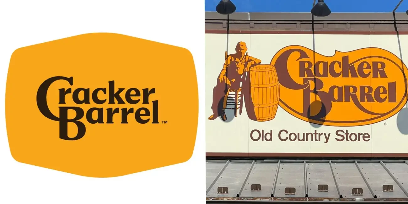
The now-scrapped Cracker Barrel logo (left) and its "Old Timer" logo (right). Source: Insider composite
Cracker Barrel also tried to evolve this year with sleeker visuals, less of its old-country charm. But long-time customers? They weren’t having it. Folks felt like the comfort, the nostalgia, the grandmother’s-kitchen energy that defined the place had been sanded down.
What struck me is how deeply people connect to what a brand represents, not just how it looks. Although I’m not a fan of the restaurant, I understand that when you take away the pieces tied to memories, traditions, and a sense of belonging, they feel it like a loss.
The lesson?
Change is good… but erasing the heart of your brand is not.
We saw a few quiet wins with brands like Pepsi, 7UP, Figma, Bumble, and even Nokia rolled out updates that felt intentional, modern, cohesive, but still recognizable to them.
Nothing dramatic.
No identity crisis.
Just a thoughtful evolution of where they’re going and what their communities expect of them.
Honestly? These campaigns are reminders of something I say often in my work:
A rebrand isn’t about new colors. It’s about new clarity.
Here’s what 2025’s biggest examples show us:
Start with purpose. If you don’t know why you’re shifting, a new design won’t fix the disconnect.
Honor what made people fall in love with you. Legacy isn’t a burden, it’s your anchor.
Invite community feedback early. People will tell you where the gaps are before your metrics do.
Evolve, don’t abandon. Growth should feel familiar, not foreign.